|
workspace.rar Size : 3.083 Kb Type : rar |
In this project, I use the density visualization tool that I presented in project 3 to visualize electricity / water / natural gas usage at Prof.Anday's home.
The idea of dotplot is that the dots stack on top of others to show density of data at that location.
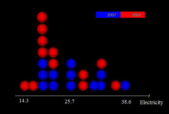
Following figure depicts 1-D dotplots. Input data: Prof.Andy's electricity usage in 2007 and 2008. From this presentation, we can easily recognize that he use more electricity in 2007 than 2008.
The dot colors present diffirent classes. User can define classification that they want to vsualize based on input data. For example:
+ Based on Year, User can use 2 colors, 1 for years in the past and 1 for recents years.
+ Based on Month, User can define to view summer months vs winter months
+ Based on utility usage, User can define to diferent levels: low, average, high
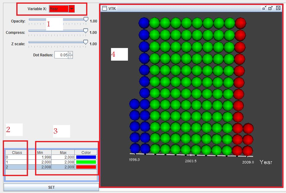
The following picture depict the process of setting up classification:
1) Choose utility to classify.
2) Enter class name.
3) Enter value range and color for class.
4) 1-D dotplots associated to this specification is updated when user is changing parameters.
Task 1: repeating pattern.
Class Definition:
+ RED: high electricity usage.
+ GREEB: average electricity usage.
+ BLUE: low electricity usage.
Class Definition:
+ RED: high electricity usage.
+ GREEB: average electricity usage.
+ BLUE: low electricity usage.
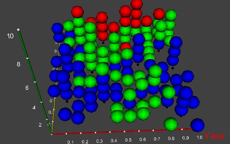
+ X axis: Year
+ Y axis: Temperature
From this visualiztion we can see: High electricity usage when temperature is high because of ari conditioning, High electricity usage from 2002 to 2005 and lower from 1998 to 2001 and from 2006 to 2009
+ Y axis: Temperature
From this visualiztion we can see: High electricity usage when temperature is high because of ari conditioning, High electricity usage from 2002 to 2005 and lower from 1998 to 2001 and from 2006 to 2009
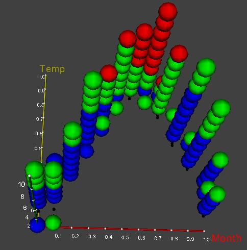
Following figure depicts depicts the same idea using:
+ X axis: Month
+ Y axis: Temperature
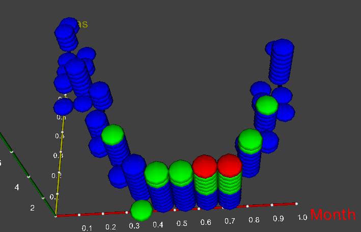
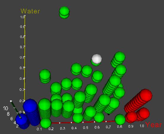
Class Definition:
+ RED: high water usage.
+ GREEB: average water usage.
+ BLUE: low water usage.
+ X axis: Month
+ Y axis: Gas
From this visualiztion we can see: Gas increases during winter becasue of heating, water usage inceases dring summer.
Task 2: long term trends.
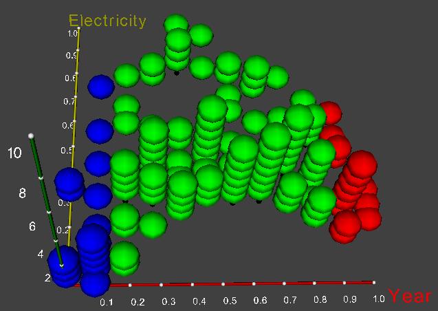
Class Definition:
+ RED: years 2008, 2009.
+ GREEN: from 2000 to 2007.
+ BLUE: years 1998, 1999 .
+ X axis: Year
+ Y axis: Electricity
From this visualiztion we can see: Electricity usage is low in 1998, 1999 then start to increase from 2000 to 2006 then decreasing recently.
Class Definition:
+ RED: years 2008, 2009.
+ GREEN: from 2000 to 2007.
+ BLUE: years 1998, 1999 .
+ X axis: Year
+ Y axis: Electricity
From this visualiztion we can see: Electricity usage is low in 1998, 1999 then start to increase from 2000 to 2006 then decreasing recently.
Class Definition:
+ X axis: Year
+ Y axis: water
The following picture show that water usage from 2000 to 2006 is relatively high then decease in 2007 and 2008. The increasement of electricity and water maybe because the equipment in Andy's house became too old and recent improvement thank to innovation.
+ X axis: Year
+ Y axis: water
The following picture show that water usage from 2000 to 2006 is relatively high then decease in 2007 and 2008. The increasement of electricity and water maybe because the equipment in Andy's house became too old and recent improvement thank to innovation.
Task 3: some hypothesis.
In the input data files, there are 2 missing values of water in February and March 2009. So, the next task is to predict those values based other information: gas, electricity, temperature of these months and what we learned from utility usage in the past.
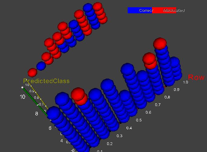
In order to realize this task I use Bayesian classifier. I have tested this classification using leave-1-out cross validation and it gives a very good results: 80% prediction correctly. I also use dotplots to see the testing results which are dicpected by the next picture in that:
+ RED: misclassified.
+ BLUE: correct.
In the input data files, there are 2 missing values of water in February and March 2009. So, the next task is to predict those values based other information: gas, electricity, temperature of these months and what we learned from utility usage in the past.
In order to realize this task I use Bayesian classifier. I have tested this classification using leave-1-out cross validation and it gives a very good results: 80% prediction correctly. I also use dotplots to see the testing results which are dicpected by the next picture in that:
+ RED: misclassified.
+ BLUE: correct.
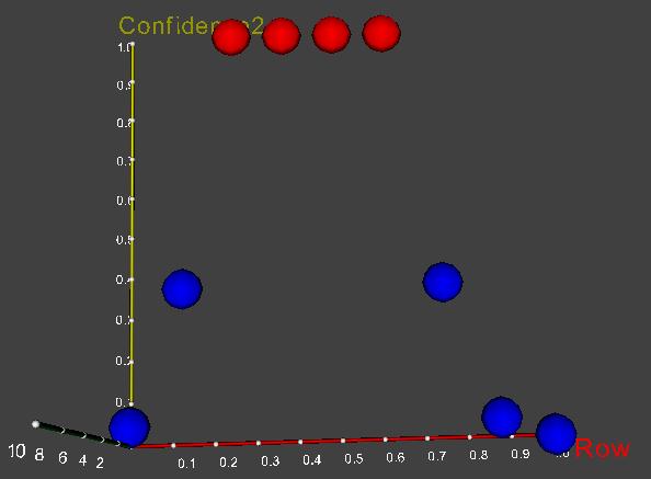
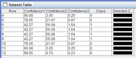
Based on this result, I use Bayesian classifier to predict other utility usage in remaining months of 2009. The following picture depicts predicted water usage and the table shows all prediction values.
+ April 2009: low water usage (BLUE) with confidence 96.68%
+ May 2009: low water usage (BLUE) with confidence 78.05%
+ June, July, August, September 2009: medium water usage (RED) with confidence 56.08%
+ November 2009: low water usage (BLUE) with confidence 78.05%.
+ October 2009: low water usage (BLUE) with confidence 96.68%
+ December 2009: low water usage (BLUE) with confidence 99.05%